


What KING, Dhurandhar: The Revenge and Raging Fire Posters Reveal
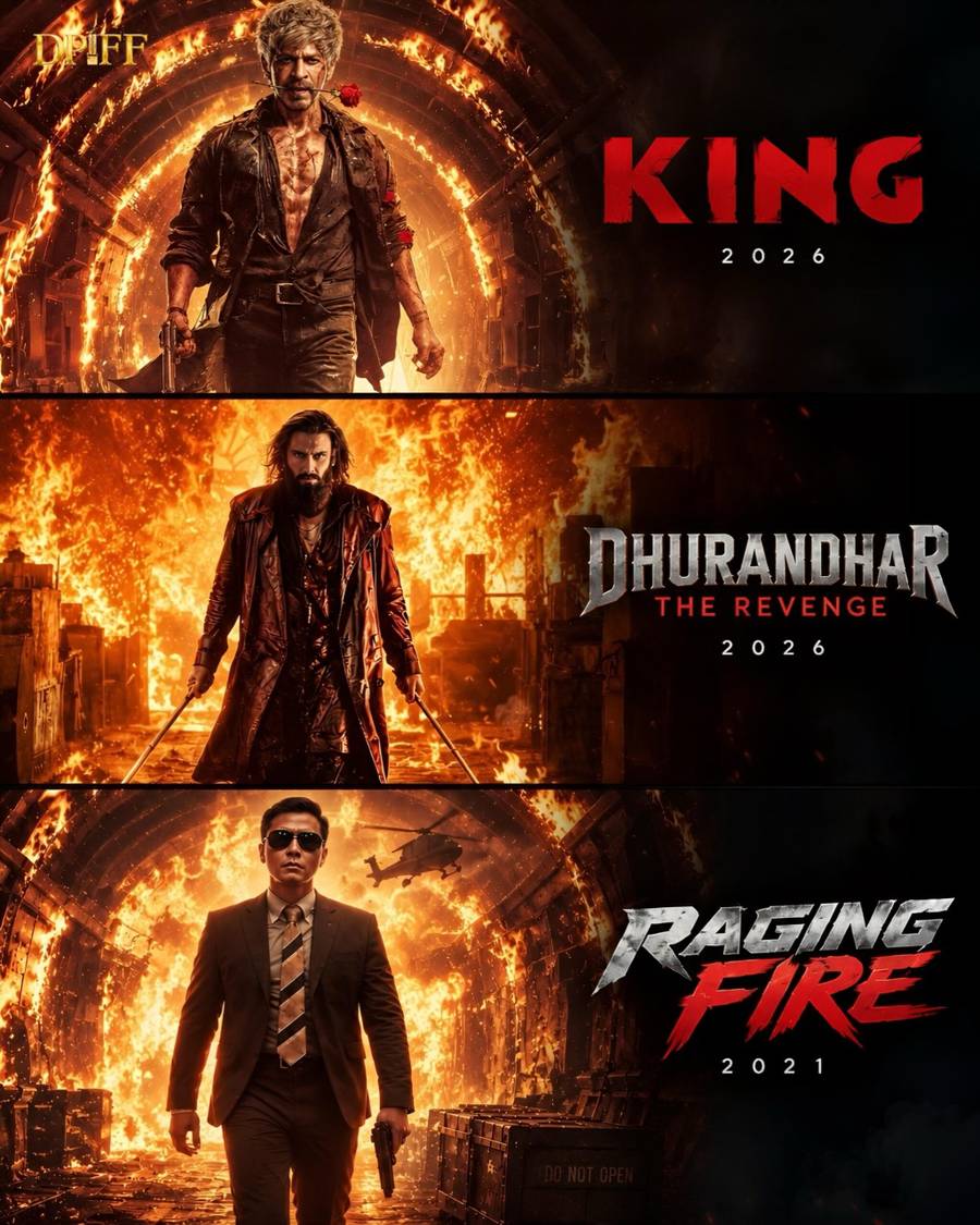
Three action-film posters—KING, Dhurandhar: The Revenge and Raging Fire—have drawn attention for the way they use fire, smoke, destruction and dramatic lighting to establish an immediate sense of scale. In a recent Instagram post, Dadasaheb Phalke International Film Festival examined the visual connection between the posters while recognising that each film has its own identity and narrative.
The comparison is not about suggesting that the films tell the same story. Instead, it highlights how contemporary action cinema often relies on a shared visual vocabulary to communicate danger, intensity and spectacle before audiences know the full details of a film. A figure walking towards chaos, a burning background or a sky filled with smoke can create an emotional response within seconds.
Why fire works so effectively in action-film posters
Fire is one of the most direct visual symbols available to a poster designer. It can represent destruction, revenge, conflict, transformation or an approaching threat. Its movement also gives a static image a sense of energy, making a poster appear active even when the central character is standing still.
In the visual treatment associated with KING, Dhurandhar: The Revenge and Raging Fire, the flames are not simply decorative. They help establish the emotional temperature of the films. Warm reds, oranges and yellows suggest heat and urgency, while darker shadows and heavy smoke add mystery and make the central figure appear more imposing.
This use of colour is particularly effective in digital viewing environments. A poster often competes for attention on social-media feeds, streaming interfaces, cinema websites and outdoor displays. Strong contrast and a clearly defined silhouette allow the image to remain recognisable even when it is viewed as a small thumbnail.
From character introduction to visual promise
Action posters frequently introduce a protagonist through posture rather than dialogue. A character moving towards the viewer, facing away from the camera or framed against an exploding landscape can communicate confidence, isolation or determination without explaining the plot.
That is the key strength of the three posters discussed by DPIFF. The protagonists appear to be positioned within, or directly before, a moment of upheaval. The surrounding destruction becomes a form of visual shorthand: it tells the audience that the character belongs to a world of high stakes and that the story will likely involve confrontation, survival or retaliation.
At the same time, poster design has to balance spectacle with identity. If the background becomes too dominant, the character can disappear into the effects. If the lighting is too uniform, the image may lose depth. The most effective action posters use destruction as a frame, allowing the protagonist, title treatment and key silhouette to remain the first elements the viewer notices.
Shared aesthetics do not mean identical films
A visual resemblance between posters should not be mistaken for evidence that the films are connected or narratively similar. Marketing campaigns often draw from familiar genre conventions because those conventions are quickly understood by audiences. Fire, smoke, sparks and backlighting immediately signal a heightened cinematic experience.
The differences between KING, Dhurandhar: The Revenge and Raging Fire remain important. The same design elements can create different impressions depending on composition, colour grading, typography, costume, setting and the way the lead character is presented. One poster may use fire to suggest power, another may use it to suggest personal loss, while a third may treat it as the atmosphere of a larger conflict.
This is also why comparisons such as the one made in the DPIFF Instagram post are useful. They encourage viewers to look beyond the title and ask how a film is being positioned before its trailer, review or full narrative reaches them.
Poster design as part of a film’s release strategy
A film poster is both an artwork and a marketing asset. It must establish genre, create recall and leave enough room for the audience to form questions. In the case of action cinema, visual intensity is often central to that first impression, but intensity alone is not enough. Composition, hierarchy and atmosphere determine whether the image feels distinctive or merely familiar.
The growing importance of social platforms has made this challenge more visible. Posters are now encountered in multiple formats, from large theatrical hoardings to vertical mobile images. A design that works in one setting may need to be adapted for another without losing its core visual identity. This makes elements such as silhouette, colour contrast and title placement increasingly significant.
Readers interested in the broader relationship between film promotion and audience response can explore the Dadasaheb Phalke International Film Festival website and its editorial news section, where cinema, filmmaking and entertainment developments are presented in an institutional context.
A closer look at the DPIFF visual comparison
The Instagram post’s central observation is simple but revealing: different films can evoke a similar cinematic mood through related design choices. In these posters, fire functions as an emotional signal, smoke creates depth and uncertainty, and dramatic lighting gives the protagonists a larger-than-life presence.
For audiences, this offers a reminder that the first encounter with a film often happens before the first frame is watched. A poster sets expectations. It can suggest whether a film will feel grounded or stylised, intimate or expansive, personal or mythic. When several films use related imagery, the comparison also opens a wider conversation about genre language and how action cinema communicates at a glance.
Recent Coverage from DPIFF
DPIFF’s News section provides the most current list of the festival’s published editorial coverage across cinema, entertainment and film-related developments. As article availability and publication order may change, readers can refer to the live archive for the latest verified headlines rather than relying on a static list.
About Dadasaheb Phalke International Film Festival
Dadasaheb Phalke International Film Festival is a platform dedicated to recognising and celebrating cinema and the creative professionals who contribute to it. The festival’s editorial work covers films, artists, filmmaking practices, entertainment developments and important conversations around the screen industries.
Through its website and official social channels, DPIFF shares film-focused stories that connect audiences with developments across Indian and international cinema. Its visual reading of the posters for KING, Dhurandhar: The Revenge and Raging Fire places the focus on how cinema begins communicating with audiences even before the film itself is released.


Share this link via


Share this link via
Share this link via
Share this link via