


How Orange Turns Emotion Into a Visual Language in Cinema
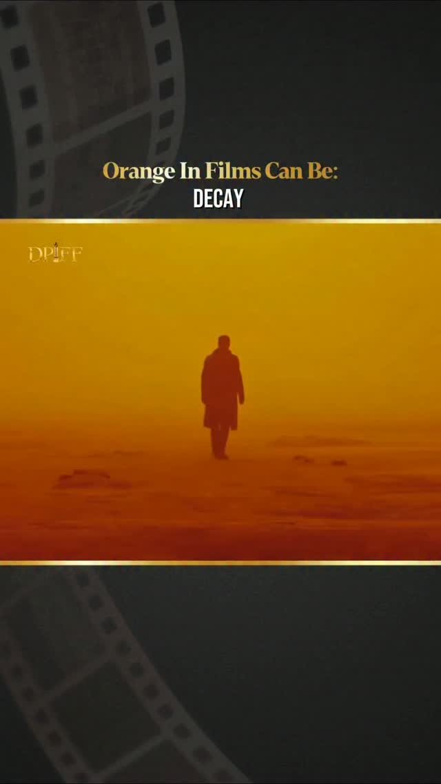
DPIFF’s Instagram reel, captioned “Multiple emotions, one colour,” draws attention to a familiar but often understated feature of filmmaking: colour can communicate feeling before a character says a word. By placing orange at the centre of the visual conversation, the post points to the way cinema uses palette, lighting and production design to shape how audiences experience a scene.
The reel does not identify a particular film, actor or filmmaker. Its focus is broader—the emotional range that can be carried by one colour. Orange can suggest warmth, intimacy and energy, but it can also create tension, unease or visual intensity depending on the scene surrounding it. That flexibility is what makes colour an important part of cinematic storytelling rather than a purely decorative choice.
Why orange has such a strong presence on screen
Orange sits between the heat of red and the brightness of yellow. In visual storytelling, that position allows it to carry contrasting associations. A soft amber glow may make a setting feel welcoming or nostalgic, while a harsher orange cast can suggest danger, instability or emotional pressure.
The meaning is shaped by context. An orange sunset, a fire-lit room and a neon-lit street may share a colour family while creating entirely different moods. Costume, set design, skin tones, camera exposure and the colours placed alongside orange all influence how viewers interpret it.
Colour theory resources such as Encyclopaedia Britannica’s overview of colour help explain why colour perception is influenced by light, contrast and surrounding tones. Cinema builds on those principles by turning colour into part of a film’s visual grammar.
From warmth and nostalgia to tension
Orange is frequently associated with firelight, sunlight and autumn landscapes, which can give a frame a sense of physical warmth. Filmmakers may use it to evoke memory, family, romance or a connection to a particular place. When combined with slower pacing, soft lighting or familiar production design, the same hue can make a scene feel intimate and reflective.
Its more intense shades can produce a very different response. Saturated orange may make a frame feel crowded, overheated or volatile, especially when paired with deep shadows or contrasting blue tones. In such cases, the colour becomes a source of pressure within the image, reinforcing a character’s anxiety or the instability of a situation.
This is why it is difficult to assign one fixed meaning to any cinematic colour. The emotional effect comes from the relationship between colour and story. A film’s genre, setting, sound design and character perspective can all change the way an audience reads the same visual choice.
Colour as part of a film’s design
Colour decisions are usually connected to several departments. Directors and cinematographers may establish the visual direction, while production designers, costume teams, makeup artists and colourists help carry that direction through individual frames. The final result depends on how these choices work together from pre-production through post-production.
For viewers, this process often operates below the level of conscious attention. Audiences may not immediately identify why a scene feels comforting or threatening, yet the palette can influence that response. The British Film Institute’s discussion of colour in film offers useful context on how filmmakers use colour to support atmosphere, character and narrative meaning.
Digital filmmaking has also expanded the possibilities available to filmmakers. Contemporary workflows allow colourists to make precise adjustments to temperature, saturation and contrast, while modern cameras can preserve detail across a wide range of lighting conditions. These tools do not replace storytelling decisions; they give filmmakers greater control over how those decisions reach the audience.
Why the DPIFF post resonates with film audiences
The appeal of “Multiple emotions, one colour” lies in its simplicity. A short visual prompt can encourage viewers to look again at familiar film images and consider how much meaning is carried by elements beyond dialogue and performance.
It also reflects the way audiences now discuss cinema online. Short-form video often isolates a visual motif—a colour, gesture, composition or recurring image—and invites viewers to recognise its presence across different films. For a festival audience, that kind of observation can lead to a deeper appreciation of cinematography, production design and the collaborative craft behind a finished movie.
Readers can view the original DPIFF Instagram reel on orange and emotion for the visual reference that prompted this editorial. The post is best understood as a cinematic observation rather than an announcement about a specific film or Hollywood release.
Recent Coverage from DPIFF
DPIFF’s official news archive remains the most reliable place to explore the festival’s recent editorial coverage, including updates and stories related to cinema, artists, awards and the wider film community. As the source post does not identify a particular film or person, linking readers to the archive avoids attributing unrelated coverage to this colour-focused reel.
About Dadasaheb Phalke International Film Festival
Dadasaheb Phalke International Film Festival is a film and entertainment platform named after Dadasaheb Phalke, widely regarded as the father of Indian cinema. Through its festival activities and editorial channels, DPIFF highlights developments across Indian and international screen culture. Its coverage includes cinema, creative professionals, awards and conversations around the craft of filmmaking. Readers can follow the organisation’s official updates through its verified Instagram channel.
Orange does not communicate one universal emotion on screen. Its significance emerges from the story, the performance, the lighting and the colours around it. That interpretive openness is precisely what makes the visual idea behind DPIFF’s reel useful: one colour can hold several feelings, and cinema gives audiences the space to read them.





Share this link via



Share this link via